Cards
Cards can be used to create flexible and extensible content containers with multiple variants and options.
Example #
Cards are built with as little markup and styles as possible, but still manage to deliver a ton of control and customization. Built with flexbox, they offer easy alignment and mix well with other components. They have no margin by default, so use spacing utilities as needed.
Below is an example of a basic card with mixed content and a fixed width. Cards have no fixed width to start, so they'll naturally fill the full width of their parent elements. This is easily customized with our various sizing options.

Card title
Some quick example text to build on the card title and make up the bulk of the card's content.
Go somewhereHTML
<div class="card" style="width: 18.75rem;">
  <img src="..." class="card-img-top" alt="...">
  <div class="card-body">
    <h5 class="card-title">Card title</h5>
    <p class="card-text">
      Some quick example text to build on the card title and make up the
      bulk of the card's content.
    </p>
    <a href="#" class="btn btn-primary">Go somewhere</a>
  </div>
</div>
Content types #
Cards support a wide variety of content, including images, text, list groups, links, and more. Below are examples of what's supported.
Content types Body #
The building block of a card is the .card-body. Use it whenever you need a padded section within a card.
Card title
Some quick example text to build on the card title and make up the bulk of the card's content.
HTML
<div class="card" style="width: 18.75rem;">
  <div class="card-body">
    <h5 class="card-title">Card title</h5>
    <p class="card-text">
      Some quick example text to build on the card title and make up the
      bulk of the card's content.
    </p>
  </div>
</div>
Content types Images, titles, text, and links #
The .card-img-top class places an image to the top of the card. Card titles are used by adding .card-title to a heading tag. Similarly, subtitles are used by adding .card-subtitle to a heading tag. If the .card-title and the .card-subtitle are placed in a .card-body, they are aligned automatically.
With .card-text, text can be added to the card. Text within .card-text can also be styled with the standard HTML tags. Links are added and placed next to each other by adding .card-link to <a> tags.
Card title
Subtitle
Some quick example text to build on the card title and make up the bulk of the card's content.
Card link Another linkHTML
<div class="card" style="width: 18.75rem;">
  <img src="..." class="card-img-top" alt="...">
  <div class="card-body">
    <h5 class="card-title">Card title</h5>
    <h6 class="card-subtitle mb-2 text-body-secondary">Subtitle</h6>
    <p class="card-text">
      Some quick example text to build on the card title and make up the
      bulk of the card's content.
    </p>
    <a href="#" class="card-link">Card link</a>
    <a href="#" class="card-link">Another link</a>
  </div>
</div>
Content types List groups #
Create lists of content in a card with a flush list group.
- List group item 1
- List group item 2
- List group item 3
HTML
<div class="card" style="width: 18.75rem;">
  <ul class="list-group list-group-flush">
    <li class="list-group-item">List group item 1</li>
    <li class="list-group-item">List group item 2</li>
    <li class="list-group-item">List group item 3</li>
  </ul>
</div>
Content types Kitchen sink #
Mix and match multiple content types to create the card you need, or throw everything in there. Shown below are image styles, blocks, text styles, and a list group—all wrapped in a fixed-width card.
Card title
Some quick example text to build on the card title.
- An item
- Another item
HTML
<div class="card" style="width: 18.75rem;">
  <img src="..." class="card-img-top" alt="...">
  <div class="card-body">
    <h5 class="card-title">Card title</h5>
    <p class="card-text">
      Some quick example text to build on the card title.
    </p>
  </div>
  <ul class="list-group list-group-flush">
    <li class="list-group-item">An item</li>
    <li class="list-group-item">Another item</li>
  </ul>
  <div class="card-body">
    <a href="#" class="card-link">Card link</a>
    <a href="#" class="card-link">Another link</a>
  </div>
</div>
Content types Header and footer #
Add an optional header and/or footer within a card using .card-header and .card-footer. Please note, these classes can also be used on heading elements. You can also use them together on the same card.
HTML
<!-- Card header -->
<div class="card" style="width: 18.75rem;">
  <div class="card-header">Card header</div>
  <div class="card-body">
    Some quick example content for the body of the card.
  </div>
</div>

<!-- Card footer -->
<div class="card" style="width: 18.75rem;">
  <div class="card-body">
    Some quick example content for the body of the card.
  </div>
  <div class="card-footer">Card footer</div>
</div>
Sizing #
Cards assume no specific width to start, so they'll be 100% wide unless otherwise stated. You can change this as needed with custom CSS, grid classes, or utilities.
Sizing Using grid markup #
Using the grid system, wrap cards in columns and rows as needed.
Card title
Some quick example text to build on the card title and make up the bulk of the card's content.
Card title
Some quick example text to build on the card title and make up the bulk of the card's content.
HTML
<!-- Card sizing using grid system -->
<div class="row">
  <div class="col-sm-6 mb-3 mb-sm-0">
    <div class="card">
      ...
    </div>
  </div>
  <div class="col-sm-6">
    <div class="card">
      ...
    </div>
  </div>
</div>
Sizing Using utilities or custom CSS #
Use the relative sizing utilities to quickly set the card's width.
Card title
Some quick example text to build on the card title and make up the bulk of the card's content.
HTML
<!-- Card sizing using relative sizing utilities -->
<div class="card w-100 w-sm-75 w-lg-50">
  ...
</div>
You can also use the specific sizing utilities to set a card's width to a specific value. Of course, this can also be done with inline CSS (as shown in most of the examples above). Please note, when setting a specific size, it's a good idea to add .mw-100 to the card to prevent issues on smaller screens.
Card title
Some quick example text to build on the card title and make up the bulk of the card's content.
Card title
Some quick example text to build on the card title and make up the bulk of the card's content.
HTML
<!-- Card sizing using specific sizing utilities -->
<div class="card specific-w-300 mw-100">
  ...
</div>

<!-- Card sizing using inline CSS -->
<div class="card mw-100" style="width: 18.75rem;">
  ...
</div>
Navigation #
Add navigation to a card's header (or block) using the navigation components. Please use the additional .card-header-tabs and .card-header-pills classes when placing tabs and pills in the card header.
HTML
<!-- Nav-tabs in card header -->
<div class="card specific-w-300 mw-100">
  <div class="card-header">
    <ul class="nav nav-tabs card-header-tabs">
      <li class="nav-item">
        <a class="nav-link active" aria-current="true" href="#">Home</a>
      </li>
      <li class="nav-item">
        <a class="nav-link" href="#">Account</a>
      </li>
      <li class="nav-item">
        <a class="nav-link disabled">Contact</a>
      </li>
    </ul>
  </div>
  <div class="card-body">...</div>
</div>

<!-- Nav-pills in card header -->
<div class="card specific-w-300 mw-100">
  <div class="card-header">
    <ul class="nav nav-pills card-header-pills">
      <li class="nav-item">
        <a class="nav-link active" aria-current="true" href="#">Home</a>
      </li>
      <li class="nav-item">
        <a class="nav-link" href="#">Account</a>
      </li>
      <li class="nav-item">
        <a class="nav-link disabled">Contact</a>
      </li>
    </ul>
  </div>
  <div class="card-body">...</div>
</div>
Images #
Cards include a few options for working with images. Choose from appending "image caps" at either end of a card, overlaying images with card content, or simply embedding the image in a card.
Images Image caps #
Similar to headers and footers, cards can include top and bottom "image caps"—images at the top or bottom of a card using .card-img-top and .card-img-bottom.
Card title
Some quick example text to build on the card title and make up the bulk of the card's content.
Some centered description.
HTML
<!-- Card image on top -->
<div class="card" style="width: 18.75rem;">
  <img src="..." class="card-img-top" alt="...">
  <div class="card-body">
    <h5 class="card-title">Card title</h5>
    <p class="card-text">
      Some quick example text to build on the card title and make up the
      bulk of the card's content.
    </p>
  </div>
</div>

<!-- Card image on bottom -->
<div class="card" style="width: 18.75rem;">
  <div class="card-body text-center py-2">
    <p class="card-text">Some centered description.</p>
  </div>
  <img src="..." class="card-img-bottom" alt="...">
</div>
Images Image overlays #
Turn an image into a card background and overlay your card's text. Depending on the image, you may or may not need additional styles or utilities.
HTML
<!-- Card image as background -->
<div class="card" style="width: 18.75rem;">
  <img src="..." class="card-img" alt="...">
  <div class="card-img-overlay d-flex flex-column justify-content-end">
    <h5 class="card-title text-center mb-0">Card title</h5>
    <p class="card-text text-center">Some quick example content.</p>
  </div>
</div>
Horizontal #
Using a combination of grid and utility classes, cards can be made horizontal in a mobile-friendly and responsive way. In the example below, we remove the grid gutters with .g-0 and use .col-sm-* classes to make the card horizontal at the sm breakpoint. Further adjustments may be needed depending on your card content.
Card title
Some quick example content.
Last updated 3 mins ago
HTML
<!-- Horizontal card -->
<div class="card overflow-hidden specific-w-300 specific-w-sm-450 mw-100">
  <div class="row g-0">
    <div class="col-sm-5">
      <img src="..." class="img-fluid" alt="...">
    </div>
    <div class="col-sm-7">
      <div class="card-body">
        <h5 class="card-title mb-1">Card title</h5>
        <p class="card-text">Some quick example content.</p>
        <p class="card-text">
          <small class="text-body-secondary">Last updated 3 mins ago</small>
        </p>
      </div>
    </div>
  </div>
</div>
Card styles #
Cards include various options for customizing their backgrounds, borders, and color. The easiest way to change a card's style is by using the color and background helper classes. You can also use the border utilities to change the border colors of the card and its sub-components. Here's an example of a customized card using .text-bg-warning.
Quick tip #7
You can use the export button to quickly get a local copy of your data. Please make sure to store it in a safe place.
HTML
<div class="card text-bg-warning border-0 rounded-0 specific-w-250 mx-auto">
  <div class="card-body">
    <h5 class="card-title">
      <i class="fa-light fa-note-sticky me-1"></i> Quick tip #7
    </h5>
    <p class="card-text">
      You can use the export button to quickly get a local copy of your data.
      Please make sure to store it in a safe place.
    </p>
    <div class="text-end">
      <a href="#" class="text-reset">Don't show again</a>
    </div>
  </div>
</div>
Please note, the icon being used is taken from the Font Awesome icon library (opens in new tab).
Accessibility
Using color to add meaning only provides a visual indication, which will not be conveyed to users of assistive technologies like screen readers. Please ensure the meaning is obvious from the content itself (e.g., the visible text) or is included through alternative means, such as additional text hidden with the.visually-hidden class.
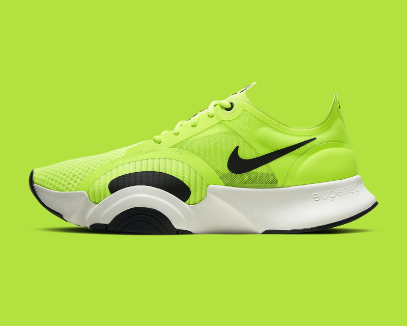
Stretched link #
Cards have position: relative by default—this makes them a great containing block for stretched links. Given below is an example of a product card created with a stretched link.
HTML
<div class="card specific-w-300 mw-100 mx-auto">
  <img src="..." class="card-img-top" alt="..." height="240">
  <div class="card-body">
    <h5 class="card-title">Cool Neon Kicks</h5>
    <p class="card-text fs-5 d-flex align-items-center">
      <strong class="text-success-emphasis me-2">$129</strong>
      <s class="fs-6 text-body-secondary">$200</s>
    </p>
    <a href="#" class="stretched-link btn btn-success btn-lg w-100">
      <i class="fa-light fa-bag-shopping me-1"></i> Add to bag
    </a>
  </div>
</div>
Card layout #
In addition to styling the content within cards, Halfmoon includes a few options for laying out series of cards.
Card layout Card groups #
Use card groups (.card-group) to render cards as a single, attached element with equal width and height columns. Footers are automatically aligned when used in cards within a group, although they are still optional. Card groups start off stacked and use display: flex to become attached with uniform dimensions starting at the sm breakpoint. For this reason, the cards in the example below has the additional utility classes to align and size them on extra small screens.
Card title
Some quick example text to build on the card title.
Card title
Some quick example text to build on the card title and make up the bulk of the card's content.
Card title
Some quick example content.
HTML
<!-- Card group -->
<div class="card-group">
  <div class="card specific-w-300 w-sm-100 mw-100 mx-auto">
    <img src="..." class="card-img-top" alt="...">
    <div class="card-body">
      <h5 class="card-title">Card title</h5>
      <p class="card-text">
        Some quick example text to build on the card title.
      </p>
    </div>
    <div class="card-footer">
      <a href="#">Read now</a>
    </div>
  </div>
  <div class="card specific-w-300 w-sm-100 mw-100 mx-auto">
    <img src="..." class="card-img-top" alt="...">
    <div class="card-body">
      <h5 class="card-title">Card title</h5>
      <p class="card-text">
        Some quick example text to build on the card title and make up the
        bulk of the card's content.
      </p>
    </div>
    <div class="card-footer">
      <a href="#">Read now</a>
    </div>
  </div>
  <div class="card specific-w-300 w-sm-100 mw-100 mx-auto">
    <img src="..." class="card-img-top" alt="...">
    <div class="card-body">
      <h5 class="card-title">Card title</h5>
      <p class="card-text">
        Some quick example content.
      </p>
    </div>
    <div class="card-footer">
      <a href="#">Read now</a>
    </div>
  </div>
</div>
Card layout Grid cards #
Use the grid system and its row column classes to control how many grid columns (wrapped around your cards) you show per row. For example, here's .row-cols-1 laying out the cards on one column, and .row-cols-sm-2 splitting four cards to equal width across multiple rows, from the small breakpoint up. Please note the following in the example below:
- The third card wraps because of
.row-cols-sm-2(two columns per row from thesmbreakpoint up). .mx-sm-autois also added to the third column to make it centered on small screens and up.- All cards are given
.h-100to make their heights the same. This is optional. - And again, the additional utility classes on the cards are used to align and size them on extra small screens, namely
.specific-w-300,.w-sm-100, and.mx-auto.
Card title
Some quick example text to build on the card title.
Last updated 3 mins ago
Card title
Some quick example text to build on the card title and make up the bulk of the card's content.
Last updated 3 mins ago
Card title
Some quick example content.
Last updated 3 mins ago
HTML
<!-- Grid cards -->
<div class="row row-cols-1 row-cols-sm-2 g-4">
  <div class="col">
    <div class="card specific-w-300 w-sm-100 mw-100 h-100 mx-auto">
      <img src="..." class="card-img-top" alt="...">
      <div class="card-body">
        <h5 class="card-title">Card title</h5>
        <p class="card-text">
          Some quick example text to build on the card title.
        </p>
        <p class="card-text">
          <small class="text-body-secondary">Last updated 3 mins ago</small>
        </p>
      </div>
    </div>
  </div>
  <div class="col">
    <div class="card specific-w-300 w-sm-100 mw-100 h-100 mx-auto">
      <img src="..." class="card-img-top" alt="...">
      <div class="card-body">
        <h5 class="card-title">Card title</h5>
        <p class="card-text">
          Some quick example text to build on the card title and make up the
          bulk of the card's content.
        </p>
        <p class="card-text">
          <small class="text-body-secondary">Last updated 3 mins ago</small>
        </p>
      </div>
    </div>
  </div>
  <div class="col mx-sm-auto">
    <div class="card specific-w-300 w-sm-100 mw-100 h-100 mx-auto">
      <img src="..." class="card-img-top" alt="...">
      <div class="card-body">
        <h5 class="card-title">Card title</h5>
        <p class="card-text">
          Some quick example content.
        </p>
        <p class="card-text">
          <small class="text-body-secondary">Last updated 3 mins ago</small>
        </p>
      </div>
    </div>
  </div>
</div>
And similar to card groups, the optional footers will line up automatically, but only if you add .h-100 to all of the cards. Here's another example with .row-cols-sm-3 (three columns per row from the sm breakpoint up).
Card title
Some quick example text to build on the card title.
Card title
Some quick example text to build on the card title and make up the bulk of the card's content.
Card title
Some quick example content.
HTML
<!-- Grid cards with footer -->
<div class="row row-cols-1 row-cols-sm-3 g-4">
  <div class="col">
    <div class="card specific-w-300 w-sm-100 mw-100 h-100 mx-auto">
      <img src="..." class="card-img-top" alt="...">
      <div class="card-body">
        <h5 class="card-title">Card title</h5>
        <p class="card-text">
          Some quick example text to build on the card title.
        </p>
      </div>
      <div class="card-footer">
        <a href="#">Read now</a>
      </div>
    </div>
  </div>
  <div class="col">
    <div class="card specific-w-300 w-sm-100 mw-100 h-100 mx-auto">
      <img src="..." class="card-img-top" alt="...">
      <div class="card-body">
        <h5 class="card-title">Card title</h5>
        <p class="card-text">
          Some quick example text to build on the card title and make up the
          bulk of the card's content.
        </p>
      </div>
      <div class="card-footer">
        <a href="#">Read now</a>
      </div>
    </div>
  </div>
  <div class="col">
    <div class="card specific-w-300 w-sm-100 mw-100 h-100 mx-auto">
      <img src="..." class="card-img-top" alt="...">
      <div class="card-body">
        <h5 class="card-title">Card title</h5>
        <p class="card-text">
          Some quick example content.
        </p>
      </div>
      <div class="card-footer">
        <a href="#">Read now</a>
      </div>
    </div>
  </div>
</div>
Card layout Masonry #
If you want to build masonry-like columns, please use a library like Masonry (opens in new tab), as this is not supported by default. Here's an example (opens in new tab) you can follow to get started quickly.
Help us grow
Our main goal is to make Halfmoon the go-to framework for building websites, dashboards and tools. If you believe in our mission, consider becoming a sponsor and help us grow.
You can email us directly if you have any queries. We are always happy to answer.
Subscribe for updates
We will notify you when the framework gets a substantial update. No spam ever.
Follow us on Twitter so that you can stay updated that way.